
Working with menus in Xmailer
Overview
Are you trying to create a flexible menu for the content you're designing in Xmailer? Look no further! We've just introduced a menu content block that makes it easier than ever to create a text-based navigation menu for your design.
You no longer have to worry about column constraints, text size, or making sure your padding is just right. Your menu will look perfect on all devices and in all email clients. You will also be able to create a mobile-optimized menu without duplicating your content. So how does it work? Let's take a look.
Adding a menu
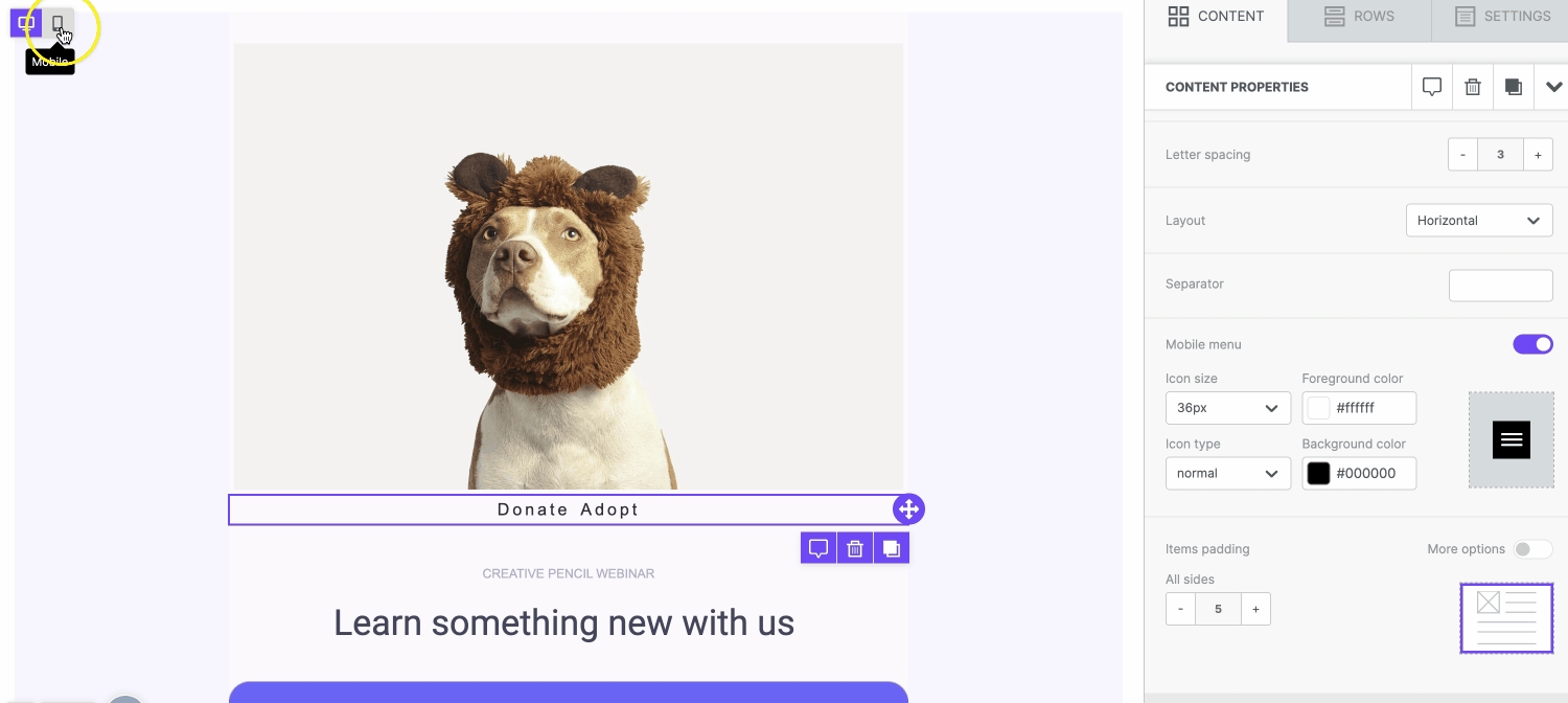
Begin by dragging and dropping a menu content block onto the builder stage. An empty menu block will populate with a placeholder image.
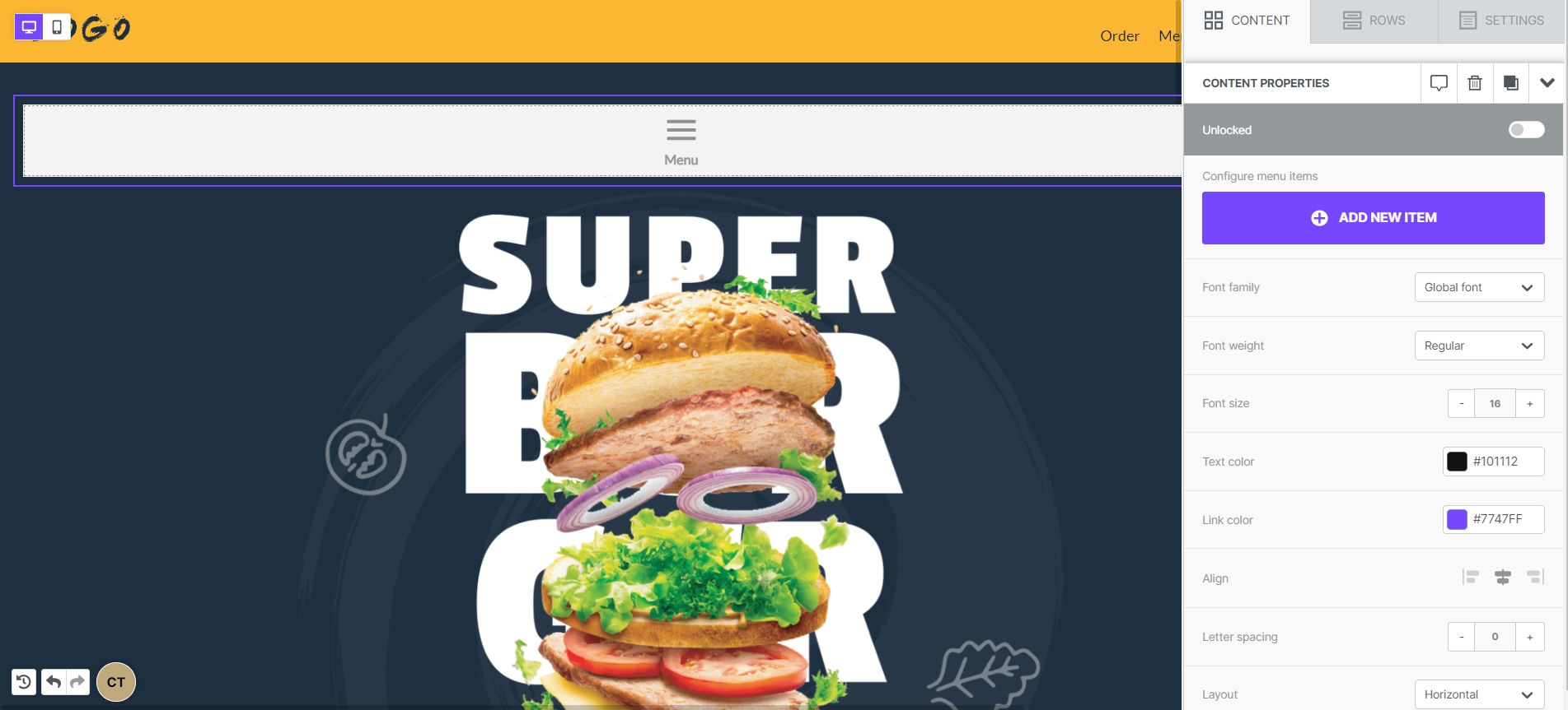
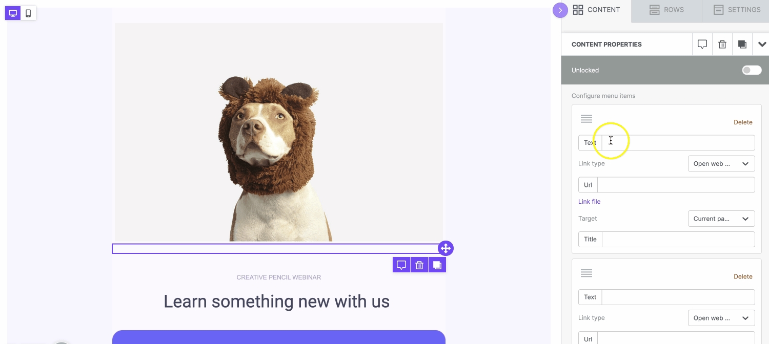
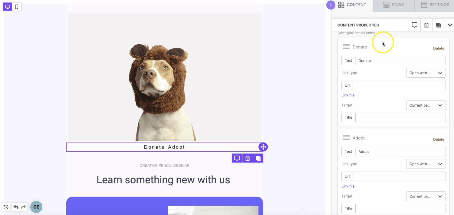
Once you have your menu content block, you'll find some settings in the sidebar. Some of these options are familiar, while others are specific to this type of content. Let's start by clicking on Add new item.
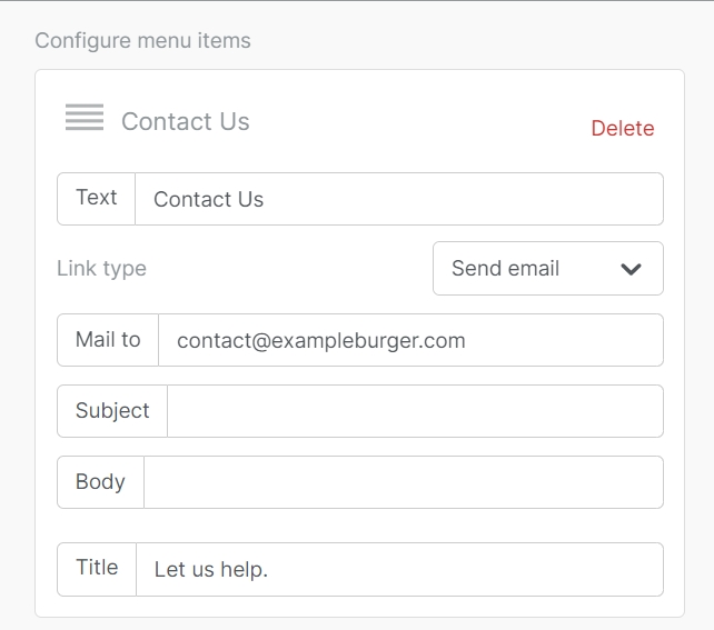
Once you begin adding items to your menu, you'll have a couple of options. Text is what you'll see written in your menu, and you can set the text hyperlink through the URL field. The text you input into the Title field will populate if you hover over that option on the builder stage.
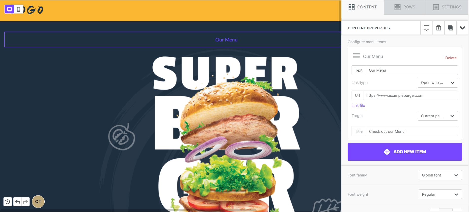
You can use different types of URLs in your design, including email, SMS, and click-to-call. For traditional URLs, you can also set the link to open in the same window or in a new tab.
You can also re-order your menu items by clicking on the icon in the upper left-hand corner of your item settings and dragging it elsewhere.
Designing your menu
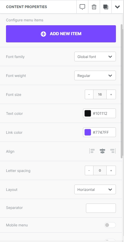
Once your menu items are ready to go, you can use the settings in the sidebar to customize your menu. You'll find text options here, and you can even change your menu layout from horizontal to vertical by selecting your preferred option from the dropdown.
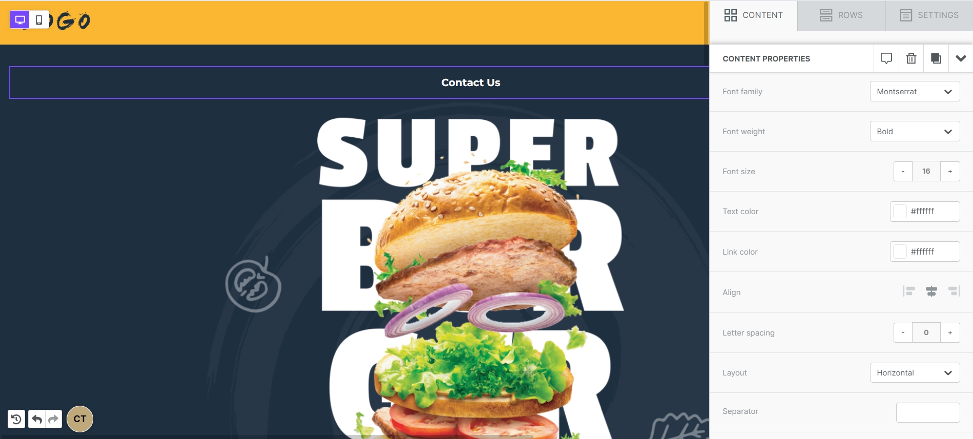
If your menu uses a horizontal layout, you'll also be able to insert a text character that can be used to divide your menu items. The color of your Separator character will match the text color you set above.

You can use the items padding option to apply padding to the individual menu items.
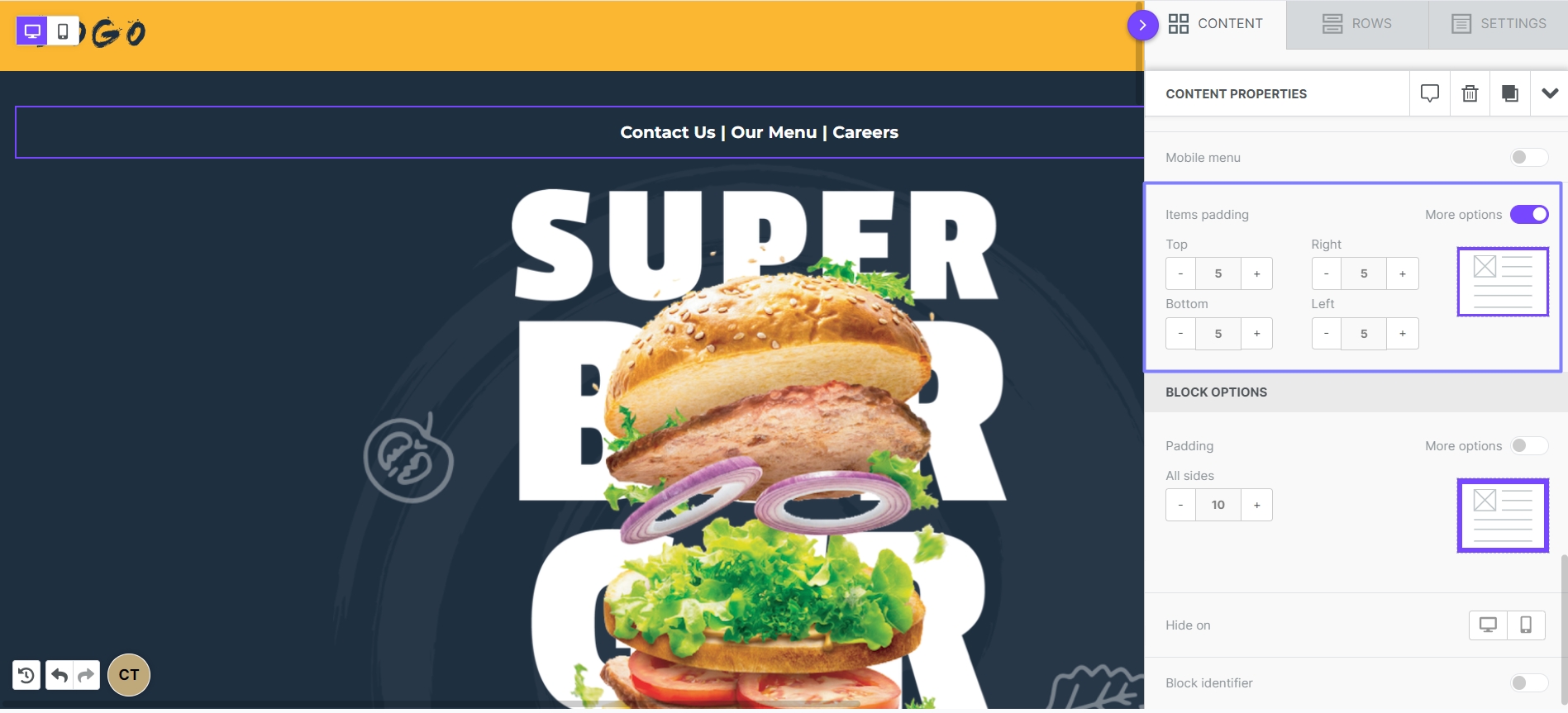
In the block options below, you'll also be able to apply padding that applies to the menu as a content block.
Mobile menus
Mobile menus are not compatible with all email clients. A comprehensive list of client support can be found below.
If you've been following along, you may have noticed that we skipped over an item available under the content properties: Mobile menus. This allows you to generate a mobile-optimized menu for your design without duplicating any content and using the hide on mobile/desktop option (though, that's still available if you prefer this!) Instead of working hard to create two versions of your menu, why not let the Xmailer builder design it for you!
Start by using the toggle button to turn on your Mobile menu. This will expand some new options under content properties.
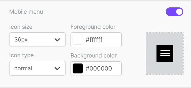
With a mobile menu, an icon will replace the menu content on a mobile device, which creates an expandable and retractable menu. By default, the mobile menu will always render vertically, and any separators that you're using will be disregarded.
You can use icon size to change how large your menu button will be. You can also choose from a normal (square) or rounded menu button via the icon type dropdown.
The foreground color will apply to the icon details, as well as the text color once your menu icon is expanded. The background color will populate only as the background color of your icon. The background color of your expanded menu will match what you have set as your content background color.
Mobile Menu Compatibility
Gmail iOS
No
Gmail Android
No
Outlook iOS
No
Outlook Android
No
iOS native
Yes
Yahoo iOS
No
Yahoo Android
No
Last updated