
Mobile Optimization Options
Often content in an email is organized in multiple columns. When viewing columns on a mobile device, they can become quite narrow. Sometimes this can lead to a sub-optimal reading experience. With that in mind, the builder will vertically stack content when it's opened on a mobile device. This automatic reorganization of content makes your design easy to scroll through. It should also prevent the need to use zoom settings to read the email.
Sometimes the default mobile optimization settings don't work with your design vision. If you want to change the mobile behavior of your design, there are plenty of features you can use to do this! Let’s go over the different options that can impact the mobile version of your design.
Desktop vs Mobile Preview
Vertical stacking is supported by the most popular mobile email clients. In some cases, the desktop version will be displayed. This happens when a client lacks support for standard CSS. For any email client compatibility, please see the email client support section.
One Size Doesn't Fit All
There are some cases in which vertical stacking of columns may not lead to the best result.
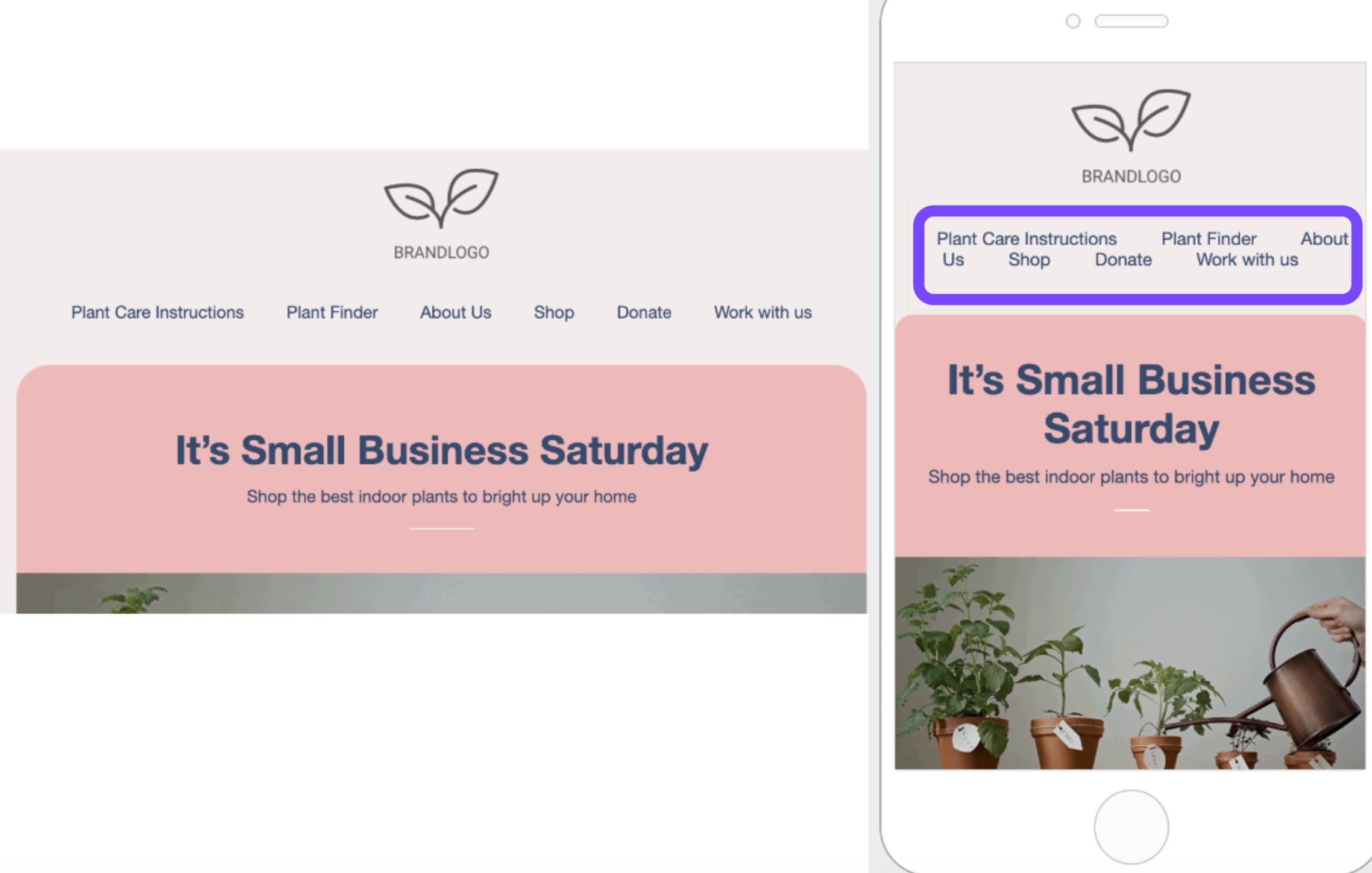
A common scenario is a row used to display a navigation bar with text links or icons. Vertically stacking this content could create excessive empty space in the design. It may also hide important elements of the design or even draw too much attention to an element.
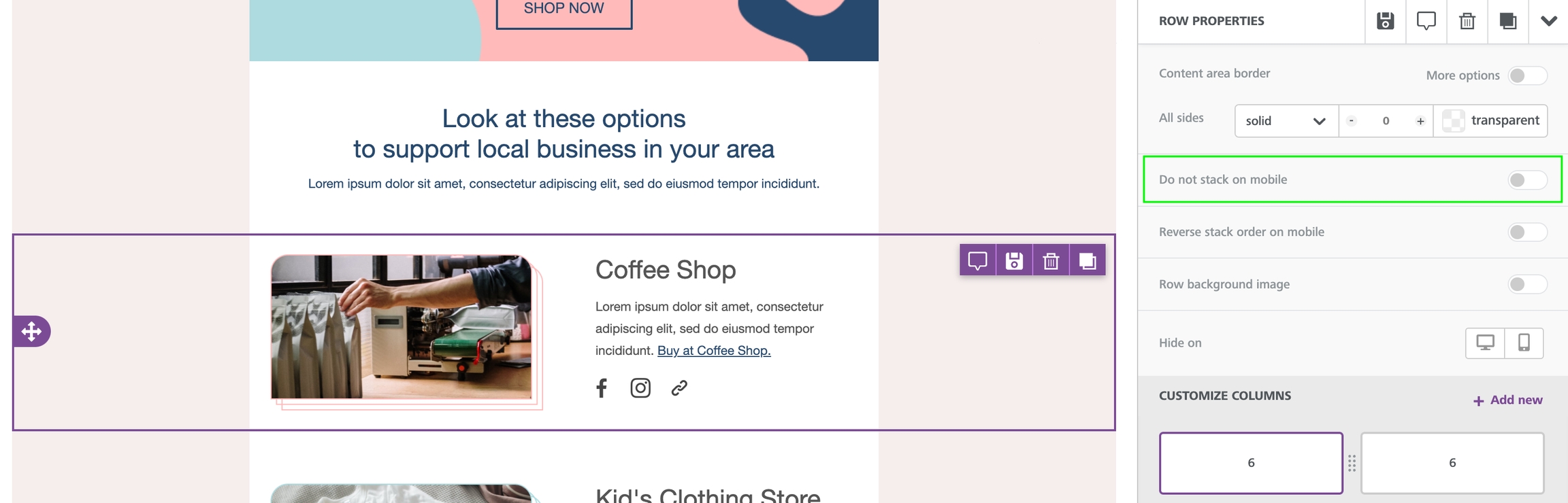
Do not stack on mobile
The Do not stack on mobile row setting allows you to override the default stacking behavior.
The option is available in the right panel as a row property, toggled off by default.
Email design best practices suggest a careful use of this display setting. A user-friendly vertical layout on mobile makes sense in most cases. As always, it is up to you and your creativity when and how to use this option.
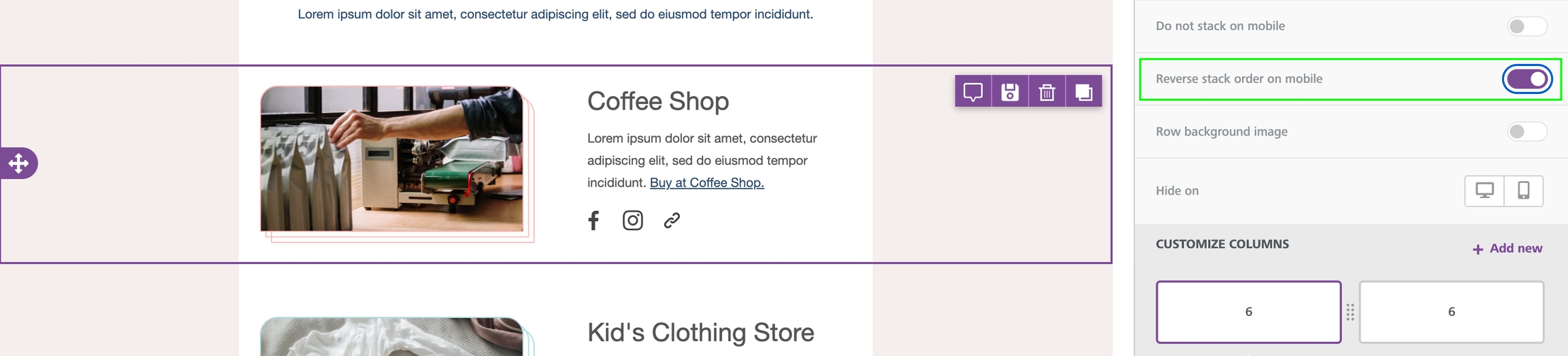
Reverse stack on mobile
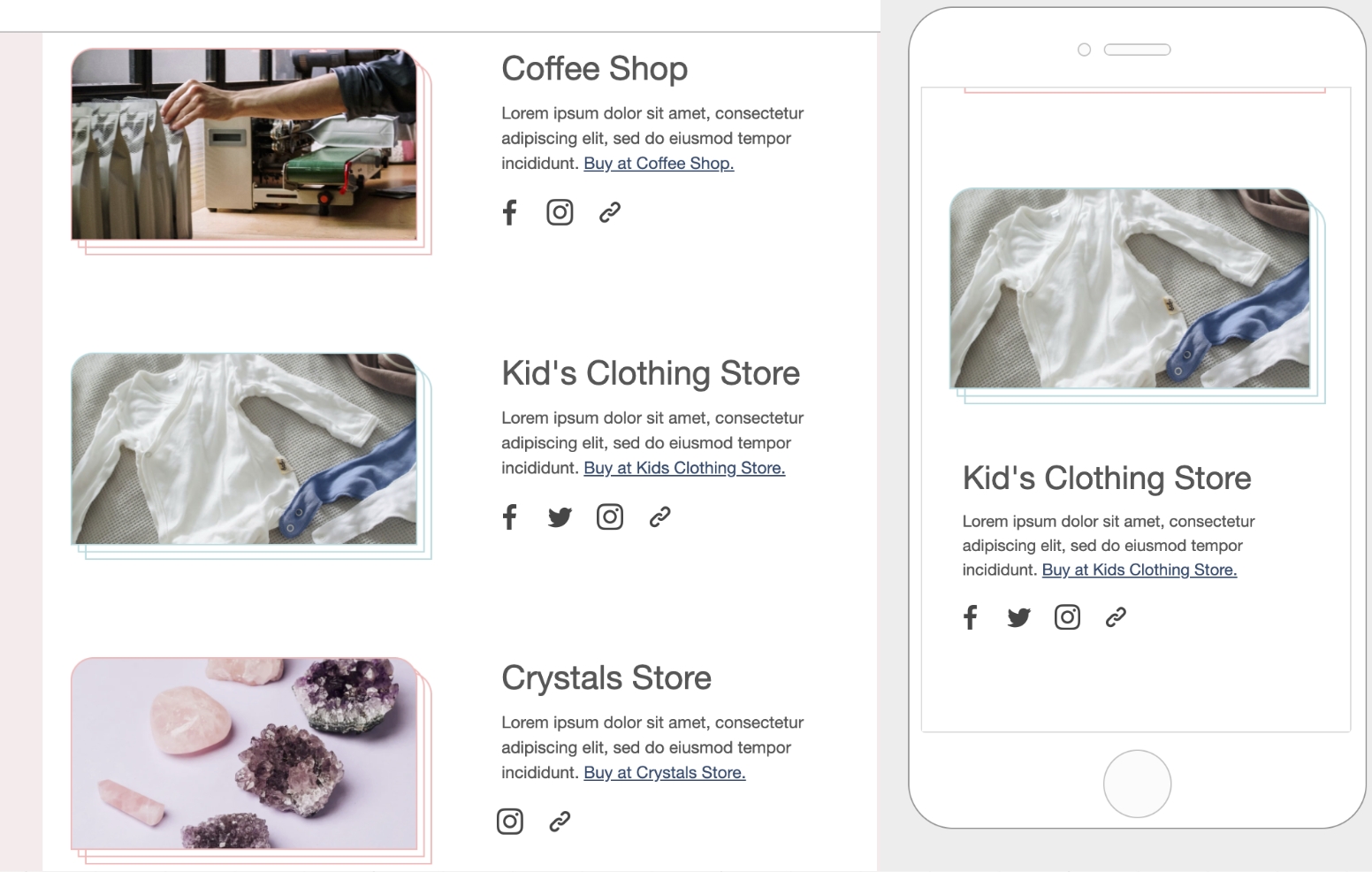
In some cases, the columns stacked on mobile can work better in a reversed order.
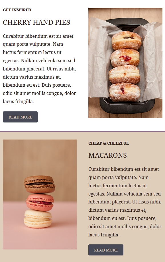
Here is an example from a Xmailer Template:
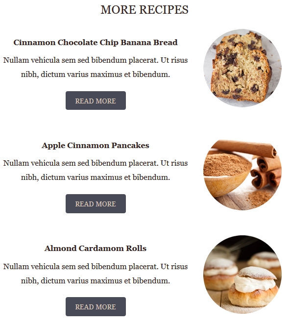
The same template also has a section where images are aligned on the right.
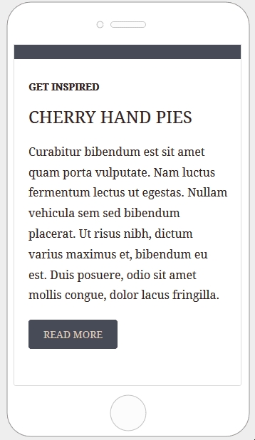
This is how these two sections render on mobile by default:
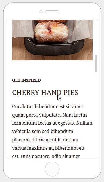
Here is how the email layout renders when columns are stacked in reverse order:
Hide on desktop/mobile
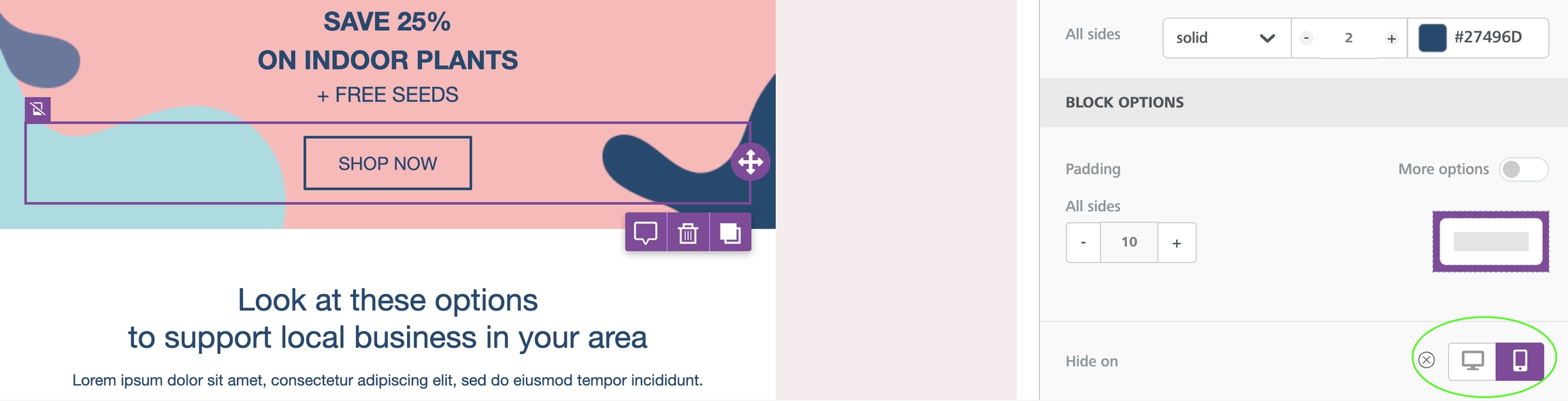
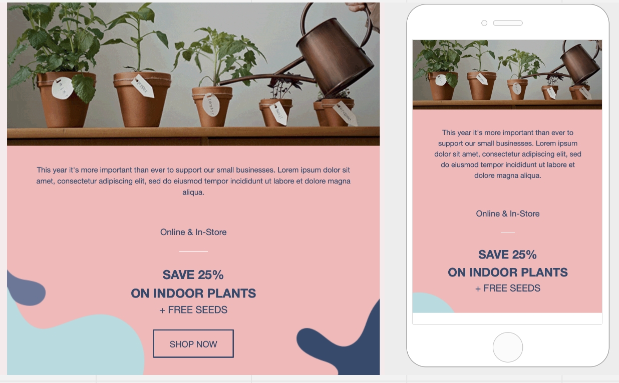
The Hide on feature is available on both the content level and the row level. This means you can now hide individual content blocks or entire rows from a specific type of device.
Hiding Content
All content blocks in the builder include a Hide on setting in the property panel. To use it, scroll down until you see the Block options section.
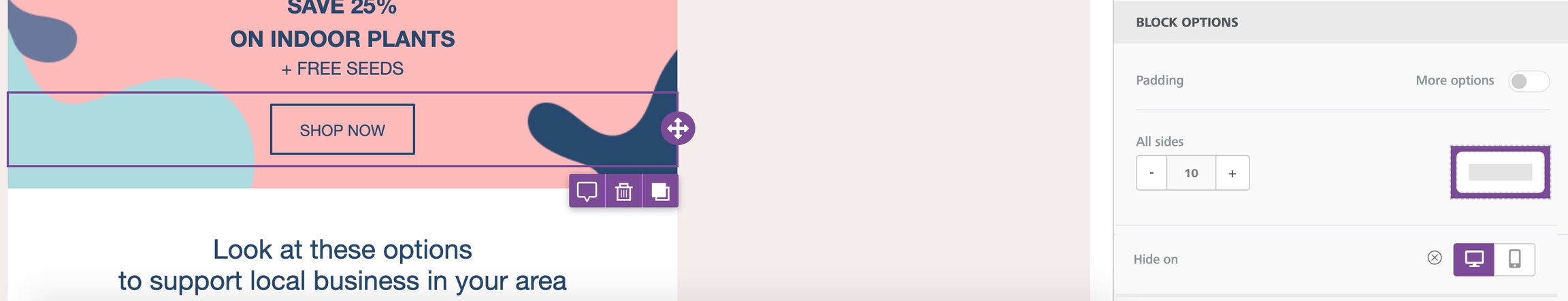
You can check the result by going into the Preview and selecting the Mobile view. You can also preview by toggling between desktop and mobile design mode. Make sure to keep visibility turned off. You will see that the content blocks for which Hide on has been turned on will not be visible.
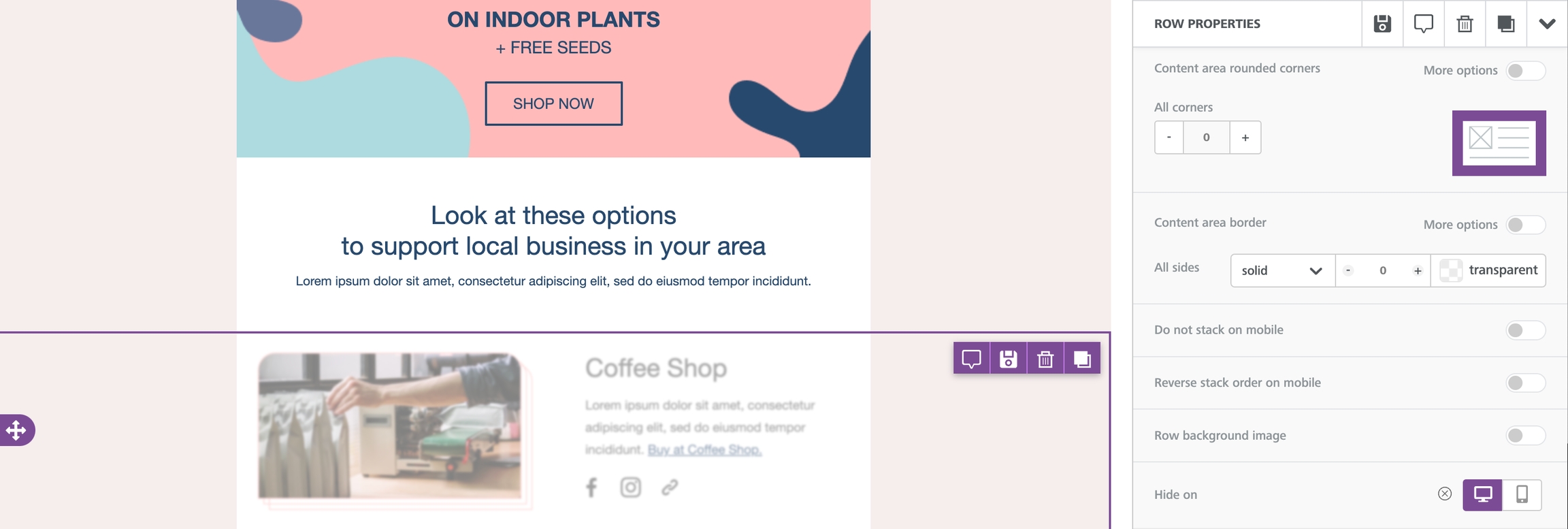
Hiding Rows
If you need to hide a larger portion of your design, you might consider hiding an entire row instead. The workflow is almost identical to the one you use to hide individual content blocks.
To start, you'll want to make sure that you select the row you want to hide. You can find this option at the bottom of the Row Properties section of the sidebar. This section is directly above the Column Properties section.
Mobile Styles (New!)
In some cases, you may want more granular control of mobile optimization. For example, you might want to modify a single element of content rather than the entire block. A common example of this is when you want to use a different text size for mobile devices.
When designing in mobile design mode, there are certain mobile styles you can apply. These design elements apply only to the mobile version of your design. You can customize mobile settings for the following elements:
Alignment
Padding
Text Size

Elements with available mobile styles will populate with an icon in the sidebar. You must be in mobile design mode to see these options.
Interested in learning more about creating mobile-optimized content in the builder? Check out Mobile design mode for more!
Last updated