
Working with borders
Border settings are available in the row settings of any design created in the Xmailer builder. While working with borders, you have the option to do so for all sides, or for each side individually. This gives you flexibility in setting the look and feel of your design.
For any border that you use, you can customize the following values:
Style (Solid, dotted, or dashed)
Width (0-30px)
Color
Row Borders
When you have a row selected on the builder stage, you will see border options in two places within the sidebar:
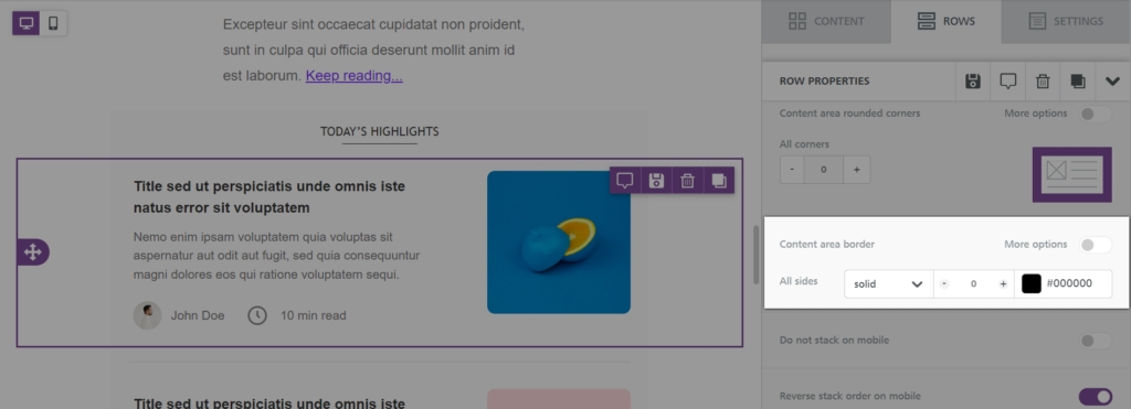
Under the Row Properties section, you will find Content area border (New!)
In the Customize Columns section, you will find another Border option
Let's take a look at how these options work.
Content Area Borders
As the name implies, a content area border will apply to the entire width of your design. This border feature applies to the entire row, rather than individual columns.
For example, say you have several two-column rows in your design. You want to apply a border to the entire row in both mobile and desktop views. You can accomplish this with the following steps:
Select the intended row on the builder stage.
Locate the Content area border option under Row properties in the sidebar.
Set a border style, width, and color.
The border will apply to the entire content area width of your row, regardless of columns. This means that it will apply to the entire row consistently, even if the content stacks.
You can also use the More options toggle to apply different border values to any side of your row. You can change the border style, width, and color for all sides.
Column Borders
If you want to apply borders to columns, use the Border option in the Customize Columns section. This option applies borders only to the column you have selected.
For example, say you're working with the same two-column design. In this case, you want to apply the border only to the column that includes text, rather than the entire row. You can accomplish this with the following steps:
Select the intended row on the builder stage. In the sidebar, scroll down to the Customize columns section. You will see the menu displaying the two different columns.

Click on column 1 to edit the properties of this column.
Set a border style, width, and color.
Repeat on each column to accomplish the desired design.
You can also use the More options toggle to apply different border values to any side of your row. You can change the border style, width, and color for all sides. You can select other columns within your row to apply unique border values to those columns.
Rounded Corners
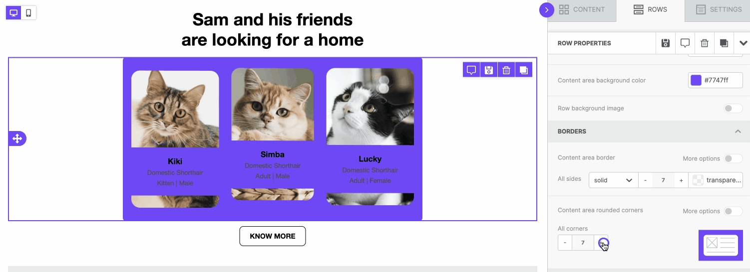
You can now apply rounded corners to any of your rows! This feature works both with and without corners. In either case, you can use this feature to apply a softer border effect to your designs. Look for the option called Content area rounded corners. It's located in the row properties sidebar, above the content area border option.
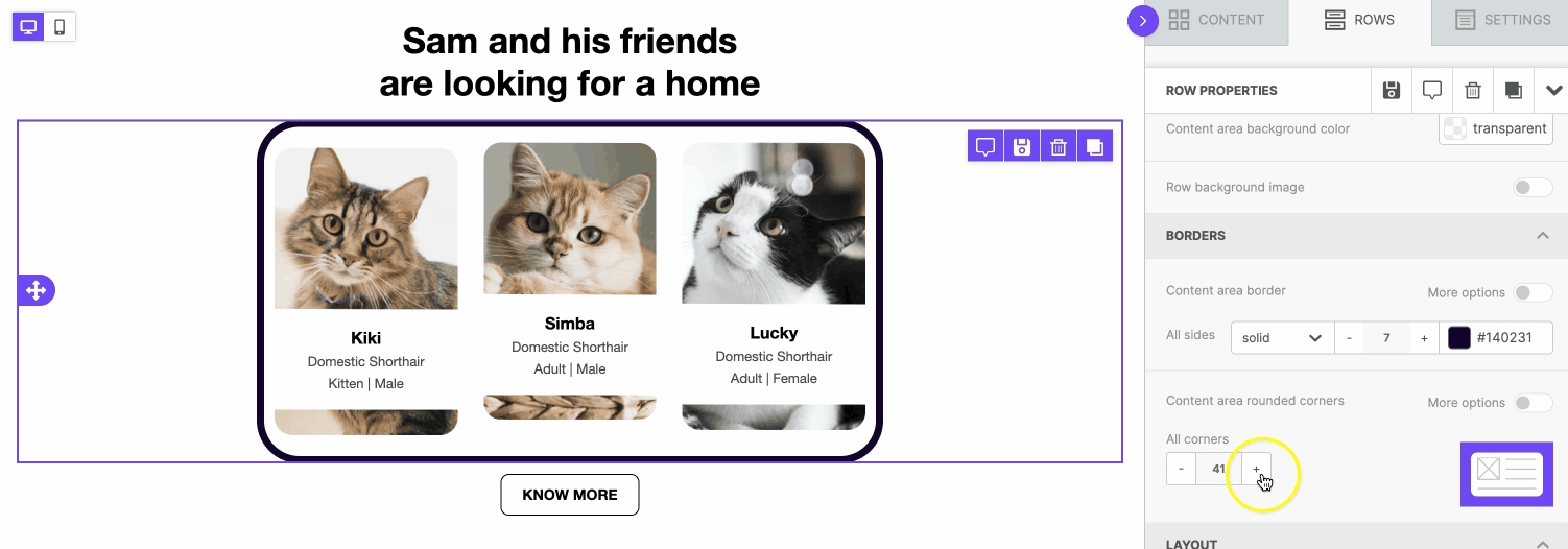
By default, the content area rounded corners feature applies to all four corners of the row. You can customize which corners are rounded by toggling on More options.
As mentioned above, you can round corners without borders as well. With this type of design, you'll want to apply a unique content area background color to the desired row. The effect will not be visible if you have the same background color applied to both the row and content area.
You can also use this feature to apply rounded corners to background images.
Last updated