
Using dividers and spacers
Overview
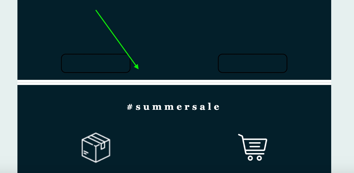
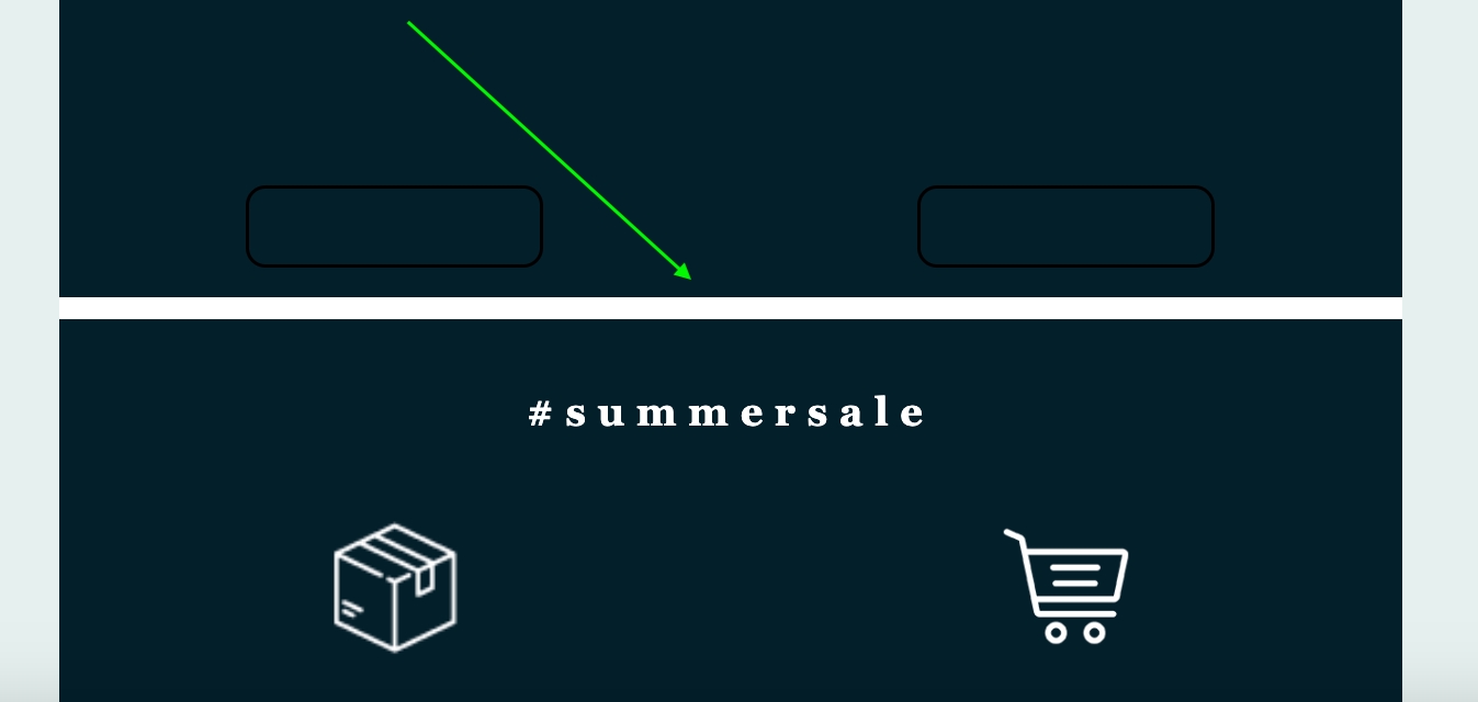
The divider and spacer content blocks can be used to create natural breaks in the design that you've created within Xmailer. In a rendered design, the divider and spacer may look very similar, but each content block provides a different set of options in the sidebar. Depending on your use case, you may prefer the divider over the spacer, or vice versa.
So what are the differences and similarities between these content blocks? Let's take a look.
Dividers
The divider content block traditionally uses a physical divider line that you can drag and drop into your design.
If you prefer to use a divider content block without this line, you can enable the Transparent toggle to remove the physical line.
If you prefer to have a visible divider, you can customize the look and feel using the Line settings in the sidebar. These settings include line appearance (solid, dotted, or dashed), line height, and a colour picker.
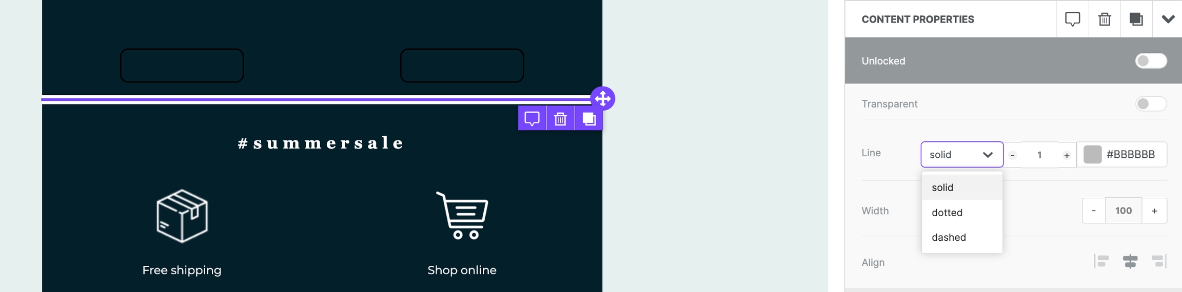
You also have access to a Width setting, which determines how much of the column containing the line will fill. You can also Align your divider to the left, centre, or right.
The divider content block also includes padding options. Divider padding works the same as it does for most other content blocks. Keep in mind that the maximum padding value on any given side is 60px, which limits the amount of empty space you can create with a divider.
Spacers
The spacer content block acts much like a transparent divider in that it simply creates blank space in your design. As a result, the only setting that the spacer has in the sidebar is Height, which allows you more granular control over the empty space you are creating.
There is no limit to the height that you can assign to your spacer. The spacer block is useful if you know exactly how much empty space you need to create in your design, particularly if you are working with background images or image content blocks that don't use the same aspect ratio.
Last updated