
Working with padding
Most design elements within the Xmailer builder include padding settings. Default padding features allow you to set the padding around an element for all sides at the same time. For more granular control, toggle on More options. This allows you to apply padding individually for each side.

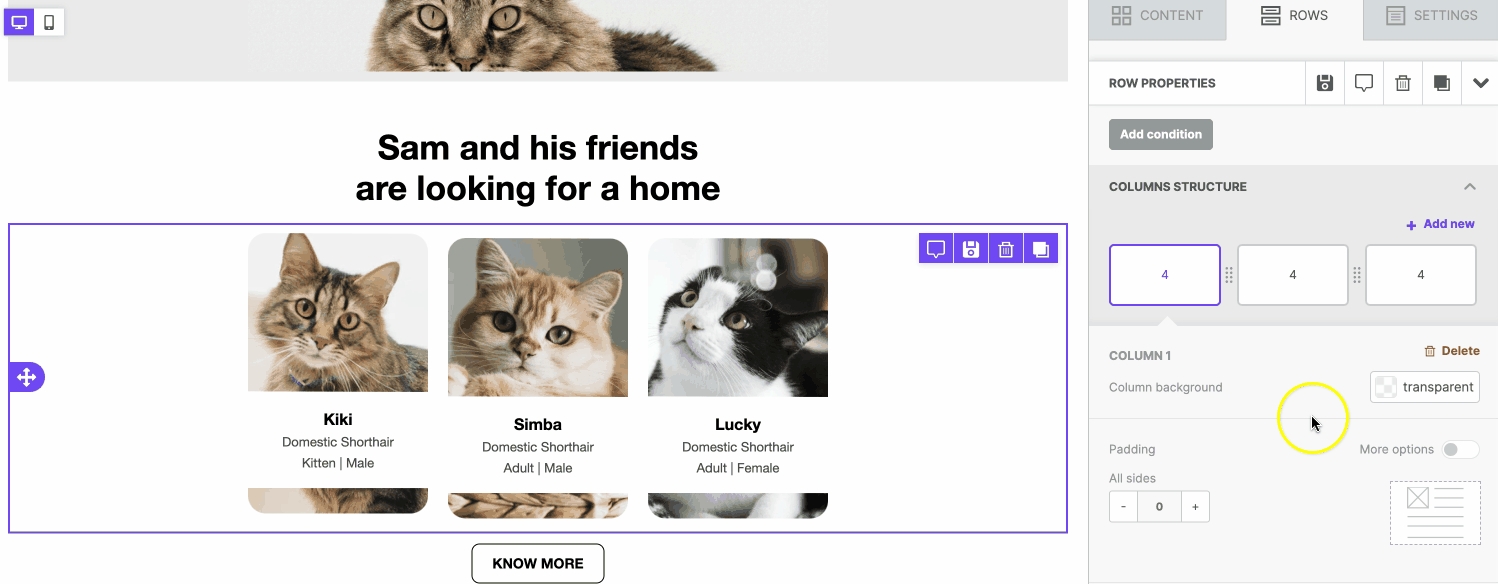
Rows
On rows, you can apply padding on the column level, under Customize Columns. You'll find this option at the bottom of the sidebar. In multi-column rows, we encourage using the same padding values on all your columns. However, you can apply unique padding values to each column if you prefer.
Content Blocks
Every content block (except for spacers) includes padding options as well. The most common padding option can be found under Block options in the sidebar. These padding values apply to the content block as a whole.
Some content blocks offer additional content padding options. These padding options apply to specific elements in the content block. Let's take a look at the content blocks with unique padding options.
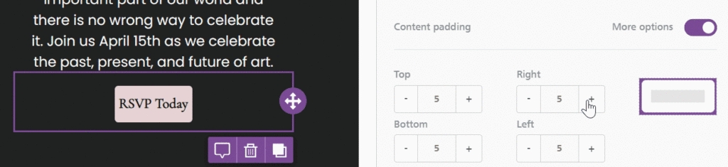
Buttons
Buttons include content padding options. This type of padding applies to the text within your button. You can use this to customize the size of your button, or where your text populates within the button.
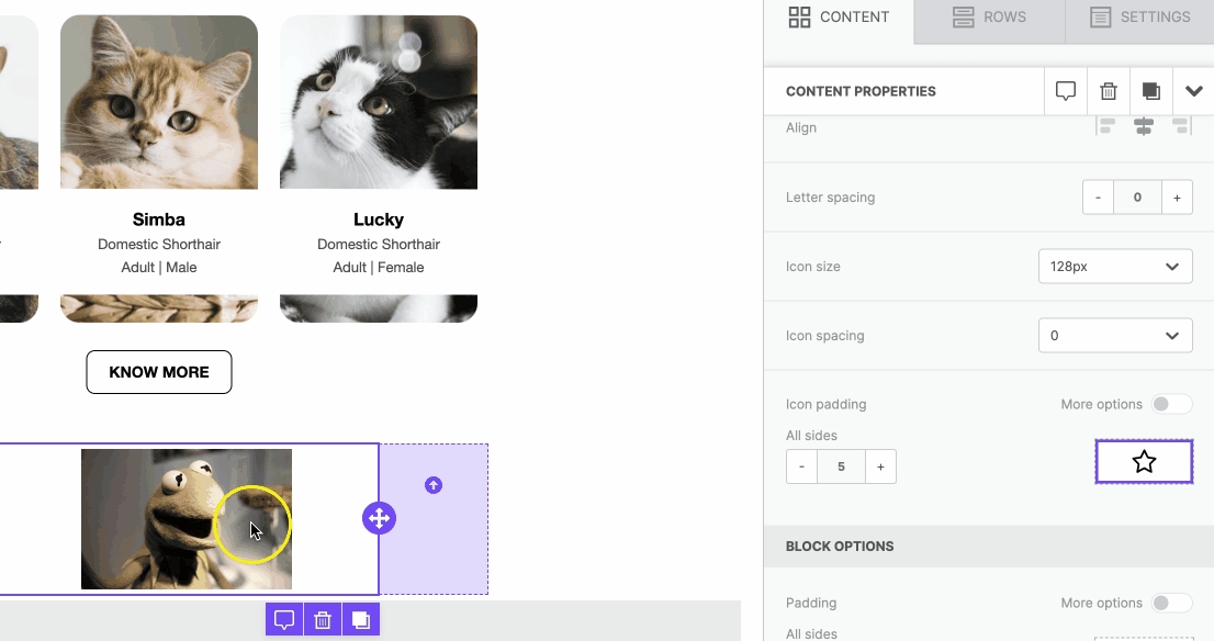
Icons
Icons include icon padding options. Remember that icons allow the use of images and text within the same content block. This type of padding will only apply to the icon images within the content block.
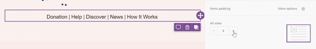
Menus
Menus include menu padding options. This is similar to spacing options you might see in other content blocks. It allows you to apply padding in between each menu item.
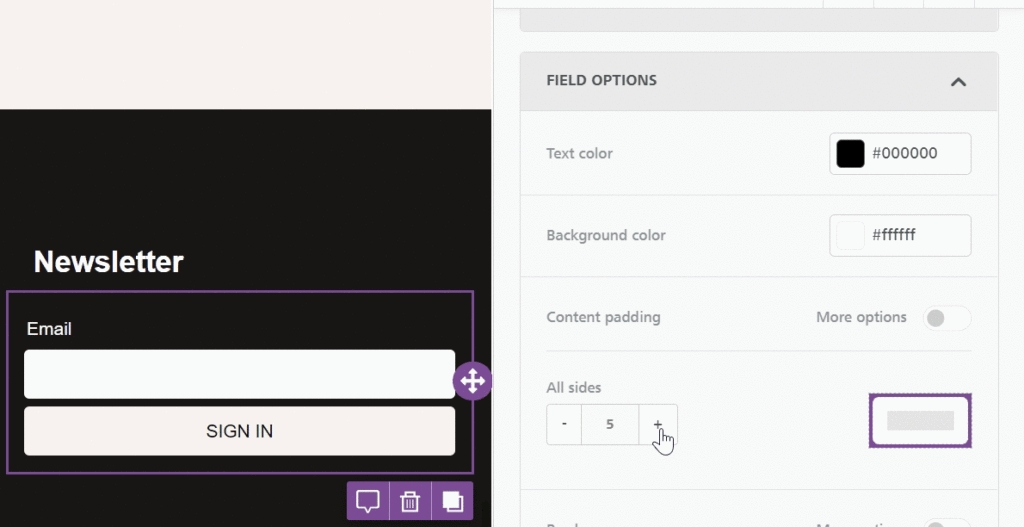
Forms
Forms are only available in the Page builder. This type of content includes two additional content padding options. You can apply content padding in Field options, which will apply to the text fields that can be filled out.
You can also apply padding in the Button options, which are identical to the button padding.
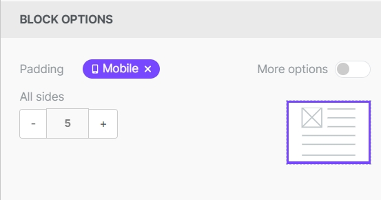
Mobile padding
In Mobile Design Mode, you can apply padding that only impacts the mobile version of your design. However, mobile padding can only be applied in the Block options on the content level. You can also apply mobile-only padding to your rows and columns.
Use the Mobile icon in the sidebar to identify elements supporting mobile padding.
You can find full details on mobile styles in our Mobile Design Mode documentation. We also talk about this feature in Mobile Optimization Options.
Last updated