
Mobile design mode
Overview
The builder includes a lot of ways that you can optimize your designs for mobile devices. For example, you can hide content from specific devices. If you don't want to hide things, you can also control how they stack on smaller screens.
However, we know it can be cumbersome to switch between the builder stage and the preview mode. This is where mobile design mode comes in! This option allows you to toggle between a desktop or mobile design stage.
We released an update for mobile design mode on July 7th, 2022. Now you can also use it to apply settings to only the mobile version of your design!
How it works
When working inside the builder, you'll see a couple of icons in the upper left-hand corner.

These icons function as a toggle that allows you to switch between a desktop and mobile view. The desktop view will allow you to work with the same builder you already know. If you switch to the mobile view, the builder content area will reduce to 320px.
When you have the mobile view enabled, you can continue to design using all the same features and options. The only unavailable option is content area width. Keep in mind that the mobile design mode uses a grey backdrop that is not part of your design.

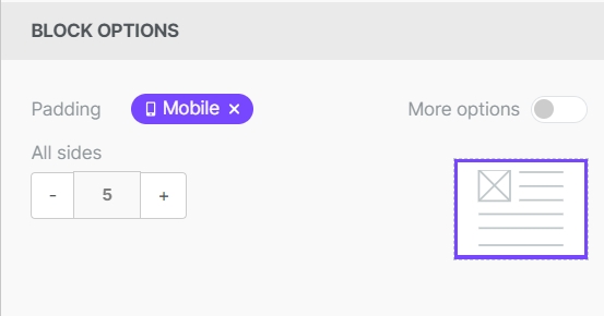
When working in mobile design mode, you can apply changes only to the mobile version of your design. This option is only available for a few design settings. You can identify these options by looking for the mobile indicator in the sidebar. In the example below, you can see this icon next to the alignment option.

Visibility Options
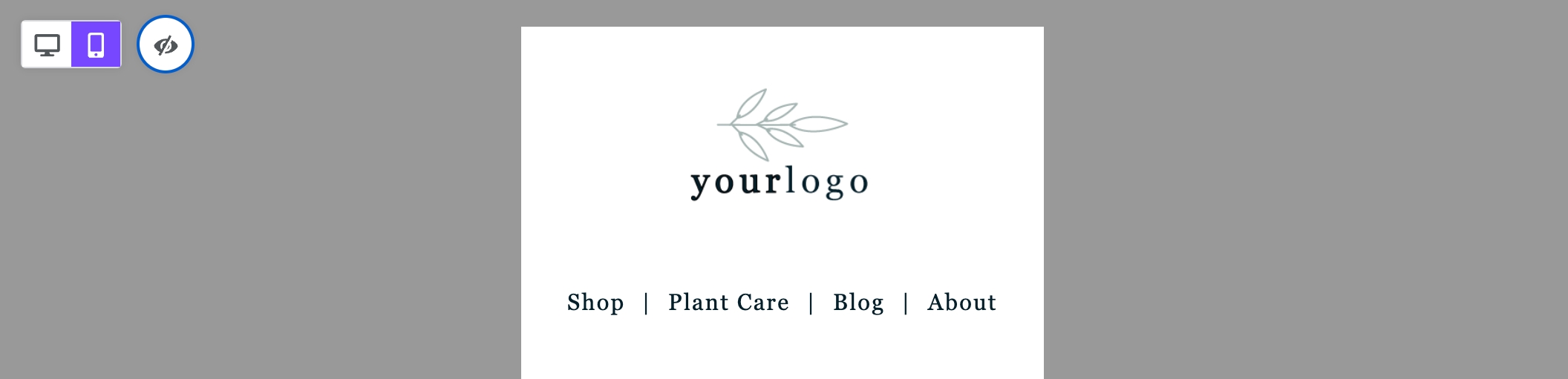
You'll see another icon next to the design mode toggle when there is hidden content in your design. This icon shows an eye and acts as your visibility toggle. By default, this feature is turned off. You will not see content that will be hidden on devices matching your design mode. With visibility enabled, you can view hidden content regardless of your design mode.
The screenshot below shows someone working in mobile design mode with visibility enabled.

With visibility enabled, you can view hidden content regardless of your design mode. The hidden content will appear translucent on the builder stage. If the designer wants the design mode to function as a preview, simply turn off visibility.
Hidden Content
Have you noticed that some content block appears translucent or out of focus? You're likely looking at content hidden from the type of device your design mode reflects. Hidden content will appear translucent so you can quickly identify it.
Say, for example, you've inserted two versions of your company logo into a design. You've optimized one logo for mobile devices and a separate logo for desktop devices. As a result, you have hidden these content blocks from the respective devices.
In desktop design mode, content hidden from that view will appear translucent.
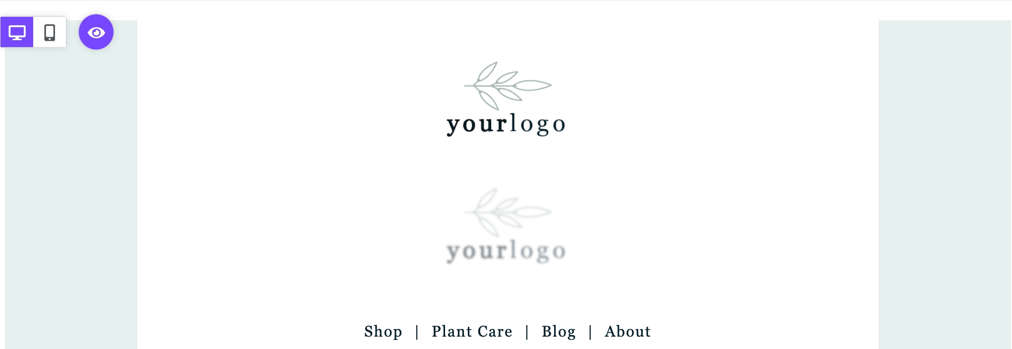
In the example above, the logo on top is hidden from mobile. It appears as expected in this design mode as a result. However, the logo below is hidden from desktop. We reduce the opacity of the content so you can identify it by sight.
Similarly, you'll see the opposite behavior in the same example in mobile design mode.
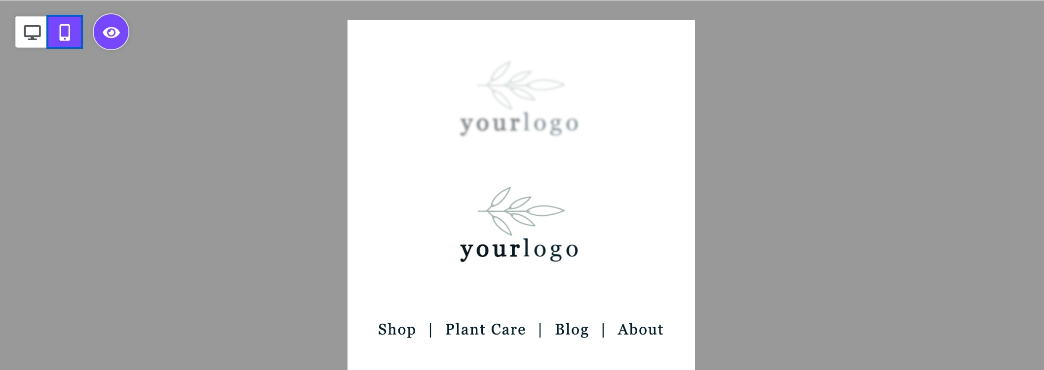
Now the opacity has been reduced on the desktop-optimized content.
When you select content hidden in your design mode, you can only change it in the sidebar. For example, if the hidden content is text-based, you won't be able to make changes. You'll need to switch to the design mode where it is always visible to update the content. However, you can alter the settings for the content block from any view.
Note that this behavior only occurs when visibility mode is enabled. If you'd prefer to see only the version of content intended for your design mode, you can turn off visibility.
Designing for Mobile Devices
Mobile Design Mode now includes mobile optimization options! You can use this design mode to set mobile-only settings for the following elements:
Alignment
Button width
Padding
Spacer height
Text size
As mentioned above, you can locate these settings by looking for the Mobile icon in the sidebar. When there are no mobile design settings, this icon displays in gray. However, if you apply changes to any of these design elements, the icon will change to purple text. This indicates that you've applied changes to only the mobile version of your design.
Edits to elements without the mobile icon impact both versions of the design.
Last updated