
Dark Mode Preview
Overview
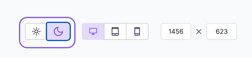
We added a new "Dark Mode Preview" toggle to the email builder's Preview mode. This allows the simulation of rendering designs on devices with dark mode enabled.

Dark mode is a device or application-specific setting. It causes colours to change in text and transparent image content. In most cases, this results in a light-coloured scheme on a dark-coloured background. While dark mode creates a pleasant experience for end-users, it poses design challenges. Rendered colour schemes may vary considerably between device types and operating system versions. Sidemail has a great article that describes different behavior across many popular email clients. You can find their article here: https://sidemail.io/articles/dark-mode-in-html-email/.
We've assessed the commonalities between the various dark modes to develop this feature. This investigation has enabled us to approximate the dark mode user experience.
Notes on Dark Mode Preview
Our goal here is to assist users in detecting design elements that may not render well in dark mode. This feature provides a general approximation of the dark mode experience. For this reason, we still recommend additional email client rendering tests.
We've thoroughly tested our standard content blocks with this feature. However, custom HTML content blocks may render differently.

How dark mode changes your email
Dark mode compatibility represents a complex challenge for email creators. Since every email client has its own version of dark mode, it is often ignored until it becomes an issue. Sooner or later, though, creators usually find they must account for it. This is where dark mode testing tools come in.
We've identified three main scenarios that may occur when an email client uses dark mode.
Nothing Changes
This generally applies to Yahoo mail and Gmail webmail. In these cases, email rendering doesn't change in dark mode. Instead, the email client UI's colour scheme is shifted.

Partial Color Inversion
This generally applies to outlook.com. In this case, light-colored sections only invert to darker colours.

Full-Color Inversion
This generally applies to the Gmail mobile app and iOS 13 platforms. This is the most destructive dark mode scenario that creators most often need help with. In this case, light colours become dark and dark colours become light. The dark mode preview feature is primarily designed to simulate this experience.

Frequently Asked Questions
Does the Xmailer builder optimize designs for dark mode?
Unfortunately, no, we cannot optimize designs for dark mode at this time. As mentioned above, all email clients handle dark mode differently. This also means that addressing the behavior is different for each email client. We're aware of methods for overwriting dark mode behaviors in Apple Mail and some web clients. Many popular clients (such as Outlook for Windows and mobile Gmail apps) do not support these methods.
We may reconsider if dark mode becomes more consistent. We may also reconsider if more email clients start supporting overwriting methods.
Do you have any tips on designing for dark mode?
We certainly do and we're happy to share! First and foremost, here are some helpful resources about the relationship between email development and dark mode:
Dark Mode for Email: What it is and How to Cope from Email on Acid
Dark mode in HTML email from Sidemail
Some of our favorite tips on designing for dark mode are as follows:
Stay away from pure white (#FFFFFF) and pure black (#000000). Instead, use off-whites and gray-blacks instead. This can help reduce the impact on email clients that perform a full inversion.
Use transparent PNGs when possible.
On images that include text, outline black text in white to ensure it will always be legible. We recommend the opposite if using white text on a dark background.
Last updated