Column management
Column Management
Here are a few of the actions you can take when using column management:
Use resizable columns
Adjust the width of each column
Add or remove a column from an existing row
Align images in a row
How it works
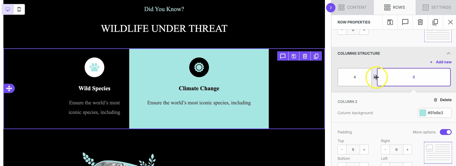
Once you start designing, add a row with the number of columns you need. Then, from the side panel, you can adjust the size of the existing columns by dragging the divider. You can also add or delete columns from the existing row.

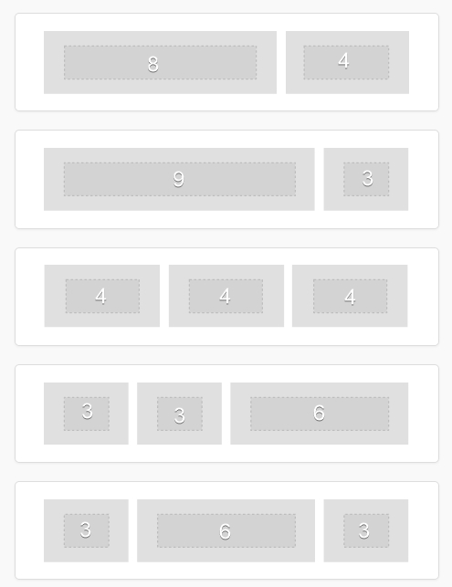
The email layout has a maximum of 6 columns, while the minimum column width is 2. This means that you can build rows like these:

Add a column
Click on + Add new action to add a new column inside the row.
Here’s how it works:
The New Column is always added on the far right, with a default size of 2 for email and 1 for pages. At the same time, the nearest column on the left is reduced accordingly.
If the left column is already at the minimum width, the next available column will resize instead.
The minimum column width is 2 for email. As a consequence, emails can have a maximum of 6 columns.
When the max number of columns is reached, the + Add new option disappears.
Remove a column
Click the Delete action in the top-right of Column structure area to remove it.
Here’s how it works:
When a column is deleted, the nearest columns on the left will inherit its width.
If the deleted column is the first on the left, the right column will inherit the width.
The Delete action will not be visible if there is just one column.
Please note
The order of the columns cannot be changed.
If you accidentally delete a column use the undo feature to restore it.
It is not possible to specify the width in pixels, only in column numbers.
The email builder allows a maximum of 6 columns.
The page builder allows a maximum of 12 columns.
Vertical alignment
Vertical alignment is a row-level option, but it’s useful when working with columns. This setting allows you to determine whether your content sits at the top, bottom, or middle of the row.
Say, for example, you have a two-column row. In one column, you have an image, and in the other column, you have text. Oftentimes, the content in each row will have different heights. This may cause unwanted empty space below the column with less content.

The entire row will always inherit the height of the taller column. In this example, the images are not as tall as the text in the other column. As a result, the text content takes up the entire height of the row. However, the image sits near the top of the row with a lot of white space beneath it. This is due to the default setting of top alignment.
Perhaps you want an equal amount of empty space above and below the image. You can use middle vertical alignment to accomplish this. If you would rather the image renders at the bottom boundary of your row, you can use bottom alignment.

Last updated